
by Varun Fuloria, Rutwik Kharkar, and Ryan Rayfield
What’s in a number? A lot, if you ask a player about their US Squash rating! Squash enthusiasts tend to be a pretty analytical bunch, and the rating system brings out the inner geeks in a lot of us.
Ratings provide a long-term measure of a player’s ability. Beyond simply tracking a player’s improvement over time, they are a useful tool to identify hitting partners of similar abilities, determine groupings for leagues and clinics, and seed competitions. Ratings start at around 1.0 for beginners and can exceed 7.0 for top professionals, a level that most of us can only dream about.
In sports like squash where players showcase their ability through competition against an opponent, instead of against a clock or other measurement, ratings fill a crucial role in measuring an individual’s level of play. In track & field or swimming, outcomes are determined by absolute performance, making it easier to measure ability. For example, few would argue that Usain Bolt turned in the best 100-meter performance of all time back in 2009 when he clocked 9.58 seconds. However, in competitive “zero-sum” sports where outcomes are determined by relative performance, quantitatively measuring a player’s abilities needs something more.
The most well-known ratings system is perhaps the one developed by Arpad Elo, a Hungarian-American physics professor and chess master. First adopted in 1960, the Elo rating system is still officially used by the World Chess Federation and unofficially used in a wide range of sports such as soccer, football, basketball, baseball, and tennis. Regardless of the sport, the idea behind the Elo rating system remains the same: the difference in ratings between two players should be a good predictor of the outcome of a match between those players. The US Squash rating system is designed with the same goal in mind.
US Squash also used an Elo ratings system until 2014, when it became clear that improvements were needed to better reconcile the ratings of players from geographically diverse regions and different modes of play including tournaments, leagues, and friendly matches. The current US Squash rating algorithm was developed between 2012-2014 by Elder Research, a data mining and predictive analytics firm based in Charlottesville, VA known for their expertise in data science and advanced analytics. The rating algorithm, already a worldwide leader, continues to increase in accuracy as changes are implemented based on research and improvements in predictive accuracy.
The US Squash rating system became even more important during the COVID pandemic. Relatively few tournaments were organized between April 2020 and April 2021, and most of the tournaments played during that time were local. Without the ability for juniors to compete in national point-based ranking tournaments, the rating system was used to determine junior ranking in each age group and seeding in tournaments.
The importance of the rating system to all ages and levels of play motivated us to explore how “good” a job the rating system does of measuring players’ abilities and predicting match outcomes. Of course, ratings will never perfectly predict results. A player rated 4.2 will not beat a 4.0 player every time they step on court. Squash is inherently an unpredictable sport. The co-authors have been at both the giving and receiving ends of many upsets in their respective squash careers!
For our analysis, we used the outcomes of squash matches played during the three years between March 26, 2018 and March 27, 2021. We restricted our analysis to matches played in US Squash accredited tournaments, as these presented the cleanest data relative to matches from local or facility-based and the like. All in all, we analyzed 79,523 matches, representing a total of 10,083 players. We performed our data analysis using R, a free open-source statistical programming language and computing environment that is commonly used by data scientists. We augmented the standard capabilities of R using additional packages for more advanced graphing and statistical functions.
First, we started by grouping these matches by rating difference, i.e. first player rating minus second player rating. For each “slice” of rating difference, we used actual match outcomes to calculate the probability of the first player winning, and plotted the results (a large number of black points) in the chart below.
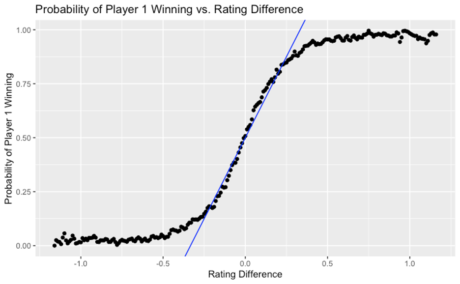
This picture makes intuitive sense. The greater the difference between the first player’s rating and the second player’s, the more likely it is that the first player will win. This “sensitivity,” as measured by the slope of the curve, is greatest when the players are more evenly matched, i.e. having ratings within 0.25 of each other. In this region, the curve roughly resembles a straight line with a slope of 1.5, which means that for each 0.1 gap in rating, the probability of the higher rated player winning increases by 0.15 or 15%.
Here is an example to illustrate this relationship. At the time of writing this article, Ryan, one of the co-authors, had a rating of 4.93, while another co-author, Varun, had a rating of 5.01. As per the rating system, they are closely matched (just 0.08 rating difference) and, if they were to play each other, Varun would have a slight edge over Ryan, with a probability of winning of 0.5 + 0.08 * 1.5 = 0.62 or 62%.
Of course, once the players’ ratings are very far apart, the straight line or linear relationship does not hold. This also makes sense intuitively because, beyond a certain point, a further increase in the gap between two players’ abilities does not change outcomes significantly. To continue our example above, the odds of a 6.0 player defeating any of the co-authors is (unfortunately for us!) quite close to 100%.
Second, we undertook a more robust approach to analyze how well players’ ratings predict match outcomes, by running a logistic regression. This is a statistical technique widely used to predict the probability of binary outcomes, such as a patient being healthy or sick, a financial transaction being genuine or fraudulent—or a squash player winning or losing a match. Running a logistic regression test using only the players’ rating difference to predict the winner of a match yielded the following:
| Coefficient | Estimate | Std. Error | P Value |
| Rating Difference | 6.28666 | 0.05514 | <2e-16* |
* In plainspeak, the very low “P value” confirms that this regression is statistically significant.
These regression results translate to the following formula:
Probability of Player 1 winning = 1 / (1 + exp(- (6.28666 * Rating Difference)))
Where Rating Difference = Player 1 Rating – Payer 2 Rating
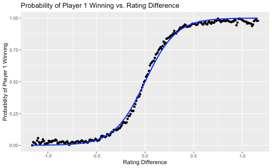
We plotted the above formula (blue curve) against the match outcome data we had previously calculated (black points) in the chart below.
As you can see in this second chart, the formula fits our data quite well and can be used to estimate the likelihood of match outcomes even when ratings are quite far apart. Admittedly, the fit is not perfect, you can see that the blue curve slightly underestimates the likelihood of the higher-rated player winning when the ratings are more comparable, and correspondingly overestimates that likelihood when the ratings are further apart.
Third, we quantitatively compared the performance of our ratings-based model with that of two extremes: (1) a perfect model that somehow predicts the correct match outcome every time, and (2) a completely random model (essentially the toss of a fair coin). In order to compare the performance of these models, we plotted their “true positive rate” against their “false positive rate” as per the following definitions:
True positive rate = # of true positives (incidents when model predicts that player 1 will win and player 1 actually wins) divided by # of positives (incidents when player 1 wins, regardless of what the model says)
False positive rate = # of false positives (incidents when model predicts that player 1 will win and player 1 actually loses) divided by # of negatives (incidents when player 1 loses, regardless of what the model says)
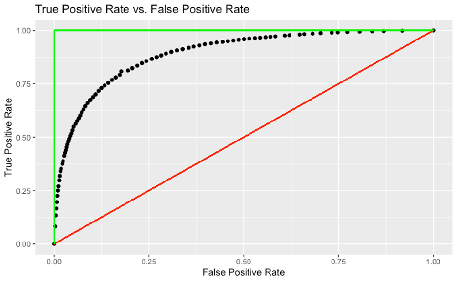
Such a curve is typically called an ROC (or Receiver Operating Characteristic) curve. ROC was introduced by the US Army in World War II to measure how well their radar systems were identifying enemy aircraft. Thankfully, our outcomes (e.g. losing a match) are less consequential than theirs (e.g. getting bombed), but the math is the same. ROC curves are extremely useful to compare the performance of different predictive models. Generally speaking, the greater the area under the curve (AUC), the more robust the model.
In this construct, a perfect model is represented by the green line with 100% AUC. On the other hand, a completely random model is represented by the red line with 50% AUC. Our model is represented by the curve made of black dots with about 90% AUC, which indicates that our model is quite robust: much closer to the perfect model (which impossibly requires the outcome of every squash match to be known before the match starts!) than the completely random one.
In summary, the US Squash rating system does a good job of representing players’ abilities in the sense that the difference in players’ ratings is a robust predictor of match outcomes. Because the rating algorithm uses match data to assess ratings, it stands to reason that we can make the ratings system better by playing (and recording) more matches with a larger number of opponents. A side benefit would be that our actual squash playing abilities might also improve!