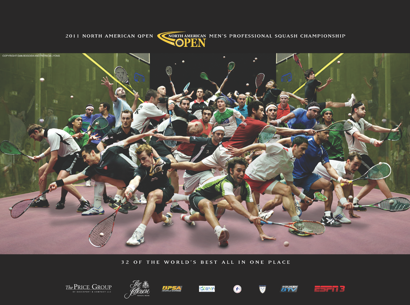
By James Zug
Marketing a tournament is easy these days: set up a website, send out some tweets, update Facebook and bam! The deal is done.
Not so fast. The North American Open has figured out that the best way to sell itself is with something old-school, something hardcopy. A commemorative poster.
Back in the 1980s, a squash poster was de rigueur for a tournament promoter. Some of the most famous ones were the cubist 1982 World Doubles one and the Frank Stella-designed mid-eighties U.S. Pro Softball posters.
It took a non-squash player to figure that out to make a dramatic return to that era. A couple of years ago Dan Bogosh, a creative advertising exec, had just moved to the Richmond area when he bumped into Gus Cook, the NAO tournament director, at a meeting about marketing a tennis club. A conversation led to Bogosh taking on the marketing of the 2011 NAO. Bogosh renovated the tournament website and created a rollicking video and then thought about a poster.
“I picked up on the one thing that stood out about the NAO—the quality of players they had coming to this little town. ‘The world’s best all in one place,’ was a good thought and it set the tone for the NAO. Gave them a brand position. Something they could own. Putting all the players on the same court playing at the same time was the perfect way to illustrate that thought.”
Bogosh wanted to sell the NAO to the city of Richmond and beyond. “I wanted the poster to not only appeal to the squash world but to the general public as well,” he said. “It had to be something that if you didn’t know squash you would still find interesting. It had to work to sell the sport to a new audience.”
Patricia Lyons, the local photographer who has shot the NAO for years (and who produced the infamous 2010 WISPA bikini calendar), lent Bogosh thousands of photos. He sifted and searched and when he found an image, as he said, he had to “cut each individual player out and transport him to the main scene. Kind of like the Star Trek Transporter, you outlined their image and zapped it to a new world. Each one had to be cut and layered into the scene and fitted just right. What happened often was while searching for one shot you found another to replace the one you had just put in.
For a long while, it wasn’t clear what it would look like. “There was a general idea of what I wanted to do in my head butI never really knew how it would all turn out. Building it as you go. It’s not like an architectural drawing that’s all planned out before you start. It’s more like handling a piece of clay. Letting it evolve.” He first used low-resolution images to see if it would work and then went back and made each image high-res. He even invented reflections for the players he put near the sidewalls to heighten the sense of reality.
The 2011 project was about throwing as many players on one court as possible. Knowing nothing about pro squash, Bogosh forgot one top-ten player. On the first night of the tournament, the player “was crushed” to find himself missing. (Bogosh went home and found an image of him, dropped it in and printed him a special copy.)
Bogosh’s poster went viral. Ramy Ashour insisted on taking home to Cairo the official 8×10 version hanging courtside. Other players and spectators grabbed copies and soon the word got out. The Richmond Times-Dispatch ran an article on the poster in its business section. Bogosh got emails from Poland, Brazil, Ireland, requesting copies.
All this raised expectations for the 2012 tournament. Bogosh made a new, slicker video and an eighty-page program that far exceeds what most tournaments produce. But how to top the 2011 poster? “In any sport the winner is always the one who wants it badly enough,” Bogosh said. “Seed the idea that it’s anybody’s game if you want ti bad enough. I started to find all these shots of players standing ready to react. In contrast to all the activity of last year’s poster, now it was one ball and all the players ready to take the shot. Who’s gonna take it? You’ve heard of that game changer, that one swing of a bat, that one block at the line, that one catch, that became the theme. One shot, One chance, who wants it. All the players focused on the ball and ready to take their shot. Only one player was not focused on the ball, Ramy. His focus was on Nick, the guy who beat him in the finals the last two years.”
Finding images of players poised to hit the ball and their eyes readable was tricky. Sometimes Bogosh had to paste new eyes in; the printer found a stray, leftover set of eyes in the background that Bogosh had misplaced. Both David Palmer and Wael El Hindi retired after he finished the poster, so he had to reformat it. Nick Matthew’s racquet was out of focus, so Bogosh substituted a different one-until Matthew caught him out. Bogosh had to cut strings out of other racquets when they were in front of a player so you could see the faces. He had to color-correct each player so they fit into the scene.
Who wants it? Everyone. the 2012 version is now even more popular than last year’s. And the marketing of a tournament might never be the same.
The posters are for sale for $30, including shipping and handling, at www.danbogosh.com.


